Propi Latam
Aug - Nov 2023 | Product/UI Designer | Propi Latam
Context & Problem Statement
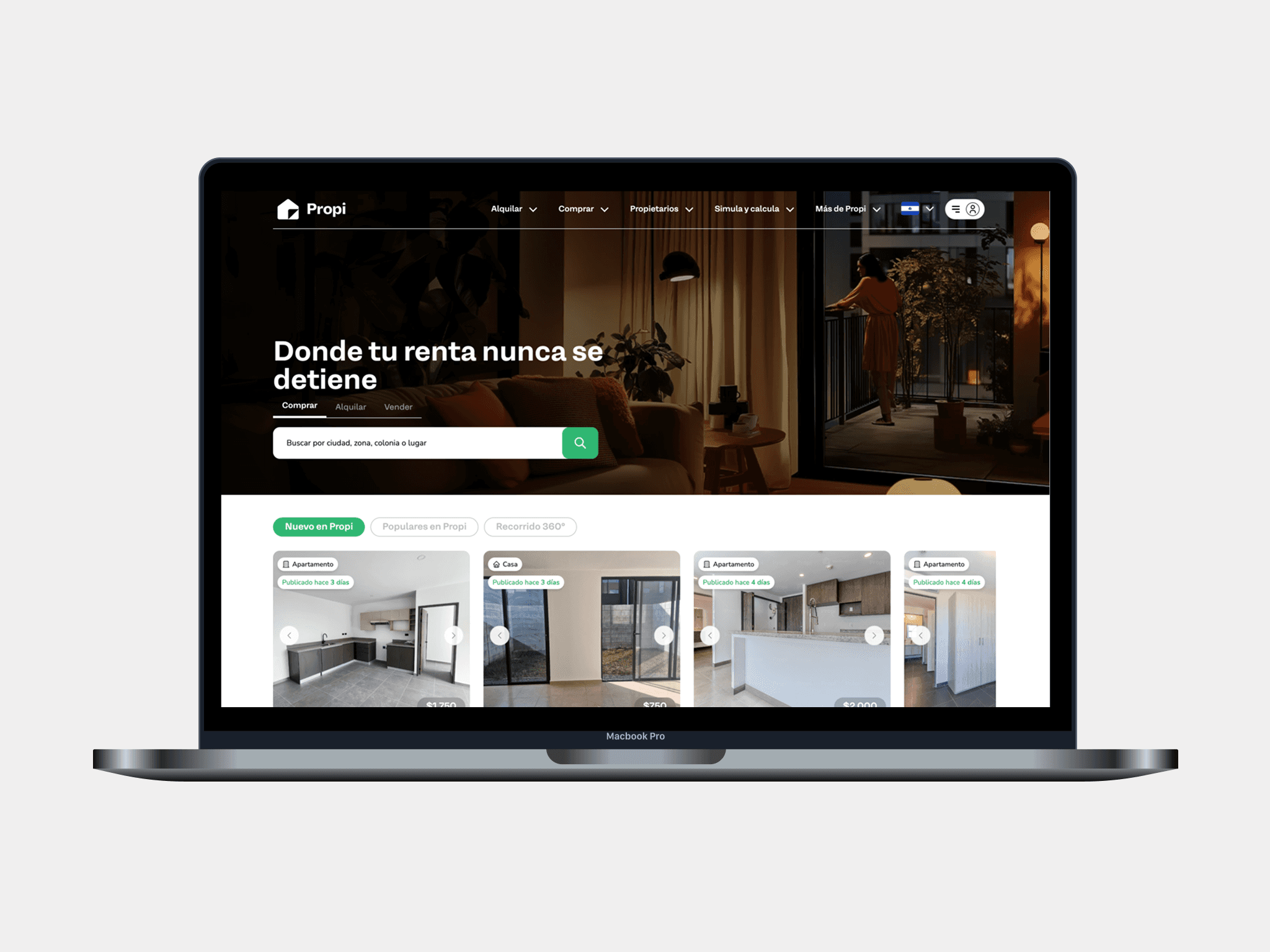
Propi LATAM is a proptech startup platform operating in El Salvador and Guatemala (Central America), offering digital tools for buying, selling, and renting properties. The website serves as a core acquisition and conversion channel, enabling users to search listings, explore property details, and initiate key real estate actions online.
Although Propi had a functional product and a growing presence in the region, the existing interface no longer supported the brand’s personality or ambitions. The UI was visually inconsistent, and lacked clear design foundations. As a result, screens felt disconnected, visual hierarchy was weak, and maintaining or scaling the interface became increasingly difficult for both design and engineering teams.
My Role & Contribution
I joined Propi LATAM as a Freelance Product / UI Designer for a 3-month engagement, working closely with stakeholders to deliver a full UI refresh of the web platform.
My role focused on UI strategy and execution, with responsibilities that included:
UI audit of the legacy product: conducted a detailed audit of existing screens, components, and flows to identify inconsistencies, usability issues, and technical debt within the UI.
Design foundations & design kit: defined the visual foundations (color, typography, spacing, layout rules) and built a reusable Design Kit with standardized components to serve as a single source of truth based on the marketing guidelines.
Screen & flow redesign: updated all core screens and user flows by replacing legacy elements with the new components and visual system, ensuring consistency and responsiveness across the platform.
UI Audit & Key Findings
The project began with a UI audit to understand how the existing interface was performing and where it was falling short. While the platform successfully supported essential real estate workflows, several recurring issues emerged:
Inconsistent components and patterns across similar screens
Outdated visual styles that no longer reflected a modern proptech brand
Weak visual hierarchy, making it harder for users to identify primary actions
Lack of reusable components, increasing design and development effort
UI decisions tightly coupled to individual screens rather than shared foundations
These issues made the product harder to maintain and scale, particularly as new features and markets were added. The audit helped align stakeholders around the need to first standardize the UI layer before focusing on incremental improvements.
Visual Foundations & Design Direction
Given that the main challenges were related to consistency, scalability, and clarity, the project prioritized establishing strong UI foundations before redesigning individual screens.
This phase focused on:
Color system: defining a cohesive palette with clear semantic usage for primary actions, secondary actions, and system states.
Typography: establishing a clear typographic hierarchy to improve readability and guide user attention across dense real estate content.
Spacing & layout rules: introducing consistent spacing, grid usage, and alignment patterns to reduce visual noise and improve scanability.
Component principles: defining how components should behave, scale, and adapt across different contexts and screen sizes.
These foundations informed every subsequent design decision and ensured the UI could evolve without reintroducing inconsistencies.
Results & Outcomes
With a clear audit and solid foundations in place, the project moved into execution. The primary goal was to deliver a modern, cohesive, and scalable UI system, applied consistently across the entire platform. The work focused on three main deliverables: Design Kit, Screen & Flow Updates, and Documentation.
Design Kit & Component Library
I created a centralized Design Kit that translated the new foundations into reusable UI components. This included:
Core components (buttons, inputs, cards, navigation, filters)
Defined states (hover, active, disabled, error)
Responsive behavior and layout variants
Guidelines for consistent component usage
Impact
Eliminated visual fragmentation across screens
Reduced time required to design and update new features
Created a shared UI language for design and engineering
Screen & Flow Redesign
Using the new components and styles, I systematically updated all key screens and user flows, including:
Property search and listing results
Property detail pages
Filters and sorting interactions
Forms and conversion-related flows
Supporting informational and marketing pages
The redesign emphasized clearer hierarchy, stronger calls to action, and more predictable interaction patterns, while preserving existing functionality.
Impact
Improved clarity and scannability across complex screens
More consistent user experience from entry point to conversion
UI that better reflects Propi’s positioning as a modern proptech platform
Reflection
This project highlighted the value of addressing UI consistency and foundations as a strategic investment, not just a visual refresh. In a short 3-month timeframe, focusing on a thorough audit and a solid Design Kit made it possible to modernize the product while also reducing long-term design and development friction. The engagement reinforced my approach to UI revamps: align early, systematize first, and execute with scalability in mind.
Other Projects
A curated selection of product and multimedia design work focused on real-world impact.